Room page
Learn how to set up the Room page on Next.js
In this guide, you will build the Room page:
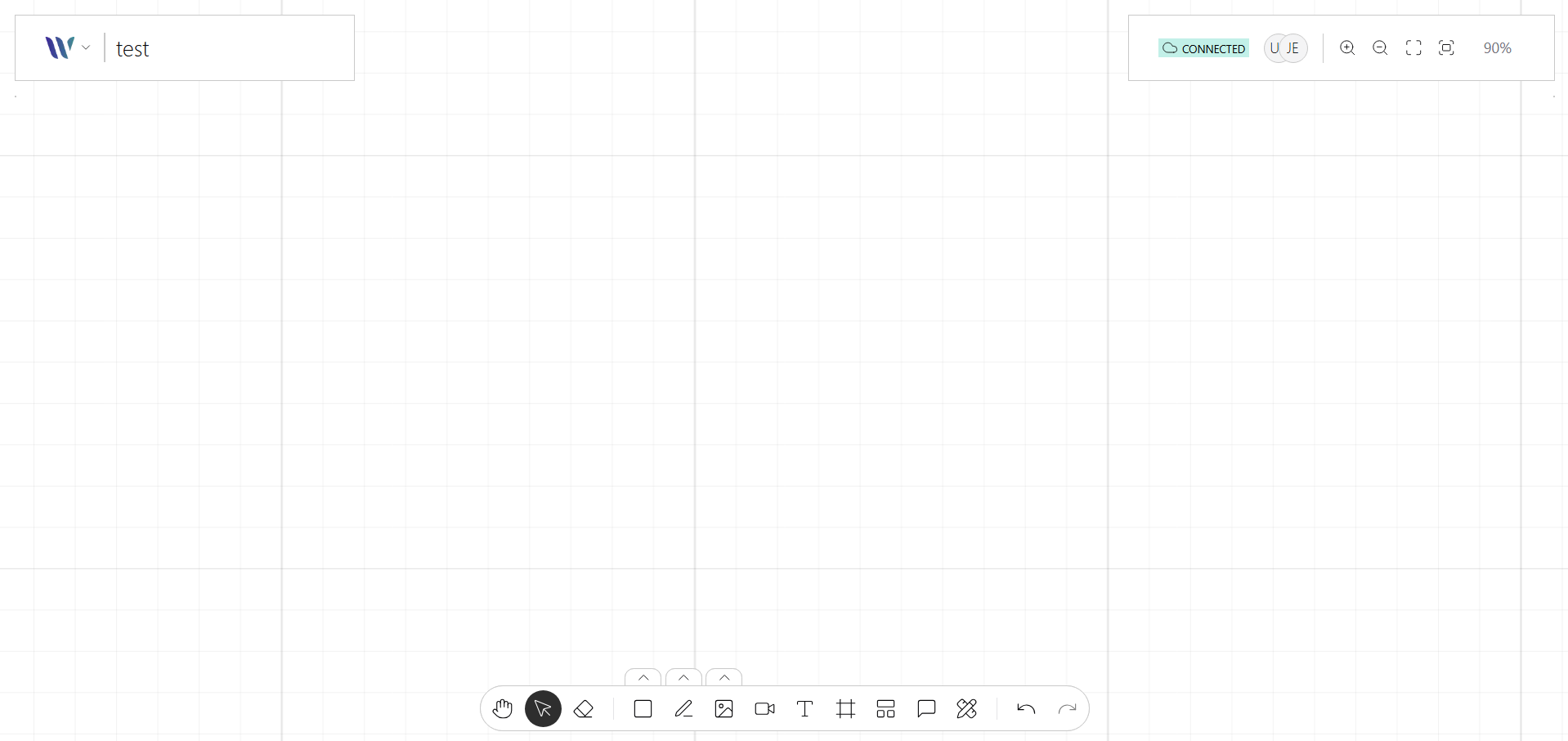
This page renders the collaborative canvas once a user joins the room.
Prerequisites
Before you begin, ensure that you have completed Set up the Enter Room page.
Step by step
To set up the Room page in your Next.js project, follow these steps:
Install the UI building block components
Set up the necessary Shadcn/UI components for the Room page.
Use the Shadcn/UI CLI and accept the default options.
From the project root folder, follow these steps:
-
Install the Tooltip component:
npx shadcn@latest add tooltip -
Install the Dropdown Menu component:
npx shadcn@latest add dropdown-menu -
Install the Avatar component:
npx shadcn@latest add avatar
Define Weave.js Nodes, Actions & Plugins to use
Define a set of constants for the Weave.js Nodes, Plugins, and Actions.
Follow these steps:
-
In the
componentsfolder, create a folder namedutils. -
In the
components/utilsfolder, create a file namedconstants.tswith:components/utils/constants.ts import { WeaveUser } from "@inditextech/weave-types"; import { WeaveMoveToolAction, WeaveSelectionToolAction, WeaveRectangleToolAction, WeaveZoomOutToolAction, WeaveZoomInToolAction, WeaveExportStageToolAction, WeaveFitToScreenToolAction, WeaveFitToSelectionToolAction, WeaveStageNode, WeaveLayerNode, WeaveGroupNode, WeaveRectangleNode, WeaveStageGridPlugin, WeaveStagePanningPlugin, WeaveStageResizePlugin, WeaveNodesSelectionPlugin, WeaveStageZoomPlugin, WeaveConnectedUsersPlugin, WeaveUsersPointersPlugin, WeaveUsersSelectionPlugin, } from "@inditextech/weave-sdk"; // (1) import { getContrastTextColor, stringToColor } from "@/lib/utils"; const FONTS = [ { id: "Arial", name: "Arial, sans-serif", }, { id: "Helvetica", name: "Helvetica, sans-serif", }, { id: "TimesNewRoman", name: "Times New Roman, serif", }, ]; // (2) const NODES = [ new WeaveStageNode(), new WeaveLayerNode(), new WeaveGroupNode(), new WeaveRectangleNode(), ]; // (3) const ACTIONS = [ new WeaveMoveToolAction(), new WeaveSelectionToolAction(), new WeaveRectangleToolAction(), new WeaveZoomOutToolAction(), new WeaveZoomInToolAction(), new WeaveFitToScreenToolAction(), new WeaveFitToSelectionToolAction(), new WeaveExportStageToolAction(), ]; // (4) const PLUGINS = (getUser: () => WeaveUser) => [ new WeaveStageGridPlugin(), new WeaveStagePanningPlugin(), new WeaveStageResizePlugin(), new WeaveNodesSelectionPlugin(), new WeaveStageZoomPlugin(), new WeaveConnectedUsersPlugin({ config: { getUser, }, }), new WeaveUsersPointersPlugin({ config: { getUser, getUserBackgroundColor: (user: WeaveUser) => stringToColor(user?.name ?? "#000000"), getUserForegroundColor: (user: WeaveUser) => { const bgColor = stringToColor(user?.name ?? "#ffffff"); return getContrastTextColor(bgColor); }, }, }), new WeaveUsersSelectionPlugin({ config: { getUser, getUserColor: (user: WeaveUser) => stringToColor(user?.name ?? "#000000"), }, }), ]; // (5) export { FONTS, NODES, ACTIONS, PLUGINS };File explanation:
(1): Import the Weave.js SDK dependency.(2): Set up the fonts available on Weave.js.(3): Define the nodes used in this example.(4): Define the actions used in this example.(5): Define the custom plugins used in this example. By default, the WeaveProvider predefines a set of plugins. In this case, which can be overridden or extended here.
Define the page React hooks
Define the hooks with the logic for the Room page. This separates component logic from UI logic.
To start, create a hooks folder in the root directory.
useHandleRouteParams hook
In the hooks folder, create a file named use-handle-route-params.ts with:
import { v4 as uuidv4 } from "uuid";
import { useCollaborationRoom } from "@/store/store";
import { useParams, useSearchParams } from "next/navigation";
import React from "react";

function useHandleRouteParams() {
  const [loadedParams, setLoadedParams] = React.useState(false);
  const setRoom = useCollaborationRoom((state) => state.setRoom);
  const params = useParams<{ roomId: string }>();
  const searchParams = useSearchParams();
  const setUser = useCollaborationRoom((state) => state.setUser);

  React.useEffect(() => {
    const roomId = params.roomId;
    const userName = searchParams.get("userName");
    if (roomId && userName) {
      setRoom(roomId);
      setUser({
        id: `${userName}-${uuidv4()}`,
        name: userName,
        email: `${userName}@weave.js`,
      });
    }
    setLoadedParams(true);
  }, [params.roomId, searchParams, setRoom, setUser]);

  return {
    loadedParams,
  };
}

export default useHandleRouteParams;
This hook handles route parameters in Next.js to extract the roomId for the connection.
useGetWebsocketsStore hook
Create a hook to manage the store instance. Its main responsibilities are:
- Fetch the initial data for the room to connect
- Instantiate Weave.js store
In the hooks folder, create a file named use-get-websockets-store.ts with:
import { useCollaborationRoom } from "@/store/store";
import { WeaveUser } from "@inditextech/weave-types";
import { WeaveStoreWebsockets } from "@inditextech/weave-store-websockets/client";
import React from "react";
import { useQueryClient, useQuery } from "@tanstack/react-query";
import { getRoom } from "@/api/get-room";

function useGetWebsocketsStore({
  loadedParams,
  getUser,
}: {
  loadedParams: boolean;
  getUser: () => WeaveUser;
}) {
  const [storeProvider, setStoreProvider] =
    React.useState<WeaveStoreWebsockets | null>(null);
  const room = useCollaborationRoom((state) => state.room);
  const user = useCollaborationRoom((state) => state.user);

  const { data: roomData, isFetched } = useQuery({
    queryKey: ["roomData", room ?? ""],
    queryFn: () => {
      return getRoom(room ?? "");
    },
    initialData: undefined,
    staleTime: 0,
    retry: false,
    enabled: typeof room !== "undefined" && typeof user !== "undefined",
  });

  const queryClient = useQueryClient();

  React.useEffect(() => {
    if (loadedParams && isFetched && room && user && !storeProvider) {
      const store = new WeaveStoreWebsockets(
        roomData,
        {
          getUser,
          undoManagerOptions: {
            captureTimeout: 500,
          },
        },
        {
          roomId: room,
          wsOptions: {
            serverUrl: `/rooms/${room}/connect`,
          },
        }
      );

      setStoreProvider(store);
    }
  }, [
    getUser,
    isFetched,
    storeProvider,
    roomData,
    queryClient,
    loadedParams,
    room,
    user,
  ]);

  return storeProvider;
}

export default useGetWebsocketsStore;
This hook is a helper to set up the Websocket Store of Weave.js.
Next, create a function to call the API.
Create an api folder in the project root.
Create inside it a file named get-room.ts with:
export const getRoom = async (roomId: string) => {
  const endpoint = `/api/rooms/${roomId}`;
  const response = await fetch(endpoint);

  if (!response.ok && response.status === 404) {
    throw new Error(`Room doesn't exist`);
  }

  const data = await response.bytes();
  return data;
};
Finally, implement the API to fetch the persisted room (in this case, on the local file system).
Create the folders /api/rooms/[roomId] inside the app directory.
Inside the [roomId] folder, add a route.ts file with:
import { fetchRoom } from "@/weave/persistence";

export async function GET(
  req: Request,
  { params }: { params: { roomId: string } }
) {
  const buffer = await fetchRoom(params.roomId);

  if (!buffer) {
    return Response.json(
      {
        error: "Room not found",
      },
      {
        status: 404,
      }
    );
  }

  return new Response(buffer, {
    headers: {
      "Content-Type": "application/octet-stream",
    },
  });
}
Define the page React components
Set up the following directories to organize our components:
- In the
componentsfolder, create aroomfolder. - In the
componentsfolder, create anoverlaysfolder.
Room
In the components/room folder, create a file named room.tsx with:
"use client";

import React from "react";
import { QueryClient, QueryClientProvider } from "@tanstack/react-query";
import { useRouter } from "next/navigation";
import { WeaveUser, WEAVE_INSTANCE_STATUS } from "@inditextech/weave-types";
import { useCollaborationRoom } from "@/store/store";
import { useWeave, WeaveProvider } from "@inditextech/weave-react";
import { RoomLayout } from "./room.layout";
import { RoomLoader } from "./room.loader";
import useGetWebsocketsStore from "@/hooks/use-get-websockets-store";
import useHandleRouteParams from "@/hooks/use-handle-route-params";
import { FONTS, NODES, ACTIONS, PLUGINS } from "@/components/utils/constants";

const statusMap: Record<string, string> = {
  ["idle"]: "Idle",
  ["starting"]: "Starting...",
  ["loadingFonts"]: "Fetching custom fonts...",
  ["running"]: "Running",
};

const queryClient = new QueryClient();

export const Room = () => {
  return (
    <QueryClientProvider client={queryClient}>
      <RoomInternal />
    </QueryClientProvider>
  );
};

const RoomInternal = () => {
  const router = useRouter();

  const status = useWeave((state) => state.status);

  const room = useCollaborationRoom((state) => state.room);
  const user = useCollaborationRoom((state) => state.user);

  const { loadedParams } = useHandleRouteParams();

  const getUser = React.useCallback(() => {
    return user as WeaveUser;
  }, [user]);

  const loadingDescription = React.useMemo(() => {
    if (!loadedParams) {
      return "Fetching room parameters...";
    }
    if (status !== WEAVE_INSTANCE_STATUS.RUNNING) {
      return statusMap[status];
    }
    if (status === WEAVE_INSTANCE_STATUS.RUNNING) {
      return "Fetching room content...";
    }

    return "";
  }, [loadedParams, status]);

  const websocketsStore = useGetWebsocketsStore({
    loadedParams,
    getUser,
  });

  if ((!room || !user) && loadedParams) {
    router.push("/error?errorCode=room-required-parameters");
    return null;
  }

  return (
    <>
      {(!loadedParams || status !== WEAVE_INSTANCE_STATUS.RUNNING) && (
        <RoomLoader
          roomId={room ? room : "-"}
          content="LOADING ROOM"
          description={loadingDescription}
        />
      )}
      {loadedParams && room && websocketsStore && (
        <WeaveProvider
          getContainer={() => {
            return document?.getElementById("weave") as HTMLDivElement;
          }}
          store={websocketsStore}
          fonts={FONTS}
          nodes={NODES}
          actions={ACTIONS}
          plugins={PLUGINS(getUser)}
        >
          <RoomLayout />
        </WeaveProvider>
      )}
    </>
  );
};
RoomLayout
In the components/room folder, create a file named room.layout.tsx with:
"use client";

import React from "react";
import { WEAVE_INSTANCE_STATUS } from "@inditextech/weave-types";
import { useWeave, useWeaveEvents } from "@inditextech/weave-react";
import { RoomInformationOverlay } from "@/components/overlays/room-information-overlay";
import { RoomUsersOverlay } from "@/components/overlays/room-users-overlay";
import { ToolsOverlay } from "@/components/overlays/tools-overlay";
import { ZoomHandlerOverlay } from "@/components/overlays/zoom-handler-overlay";

export const RoomLayout = () => {
  useWeaveEvents();

  const instance = useWeave((state) => state.instance);
  const actualAction = useWeave((state) => state.actions.actual);
  const status = useWeave((state) => state.status);

  React.useEffect(() => {
    if (
      instance &&
      status === WEAVE_INSTANCE_STATUS.RUNNING &&
      actualAction !== "selectionTool"
    ) {
      instance.triggerAction("selectionTool");
    }
  }, [instance, status]);

  return (
    <div className="w-full h-full relative flex outline-transparent">
      <div className="w-full h-full overflow-hidden">
        <div id="weave" className="w-full h-full outline-transparent"></div>
        {status === WEAVE_INSTANCE_STATUS.RUNNING && (
          <>
            <RoomInformationOverlay />
            <RoomUsersOverlay />
            <ToolsOverlay />
            <ZoomHandlerOverlay />
          </>
        )}
      </div>
    </div>
  );
};
RoomLoader
In the components/room folder, create a file named room.loader.tsx with:
"use client";

type RoomLoaderProps = {
  roomId?: string;
  content: string;
  description?: string;
};

export function RoomLoader({
  roomId,
  content,
  description,
}: Readonly<RoomLoaderProps>) {
  return (
    <div
      className="w-full h-full bg-white flex justify-center items-center overflow-hidden absolute z-[1000]"
    >
      <div className="absolute bottom-0 left-0 right-0 h-full flex justify-center items-center">
        <div className="flex flex-col items-center justify-center space-y-4 p-4">
          <div className="flex flex-col justify-center items-center text-black gap-3">
            <div className="font-noto-sans font-extralight text-2xl uppercase">
              <span>{content}</span>
            </div>

            {roomId && (
              <div className="font-noto-sans text-2xl font-semibold">
                <span>{roomId}</span>
              </div>
            )}
              {description && (
                <div className="font-noto-sans-mono text-xl">
                  <span key={description}>
                    {description}
                  </span>
                </div>
              )}
          </div>
        </div>
      </div>
    </div>
  );
}
ConnectedUsers
In the components/overlays folder, create a file named connected-users.tsx with:
"use client";

import React from "react";
import Avatar from "boring-avatars";
import { Avatar as AvatarUI, AvatarFallback } from "@/components/ui/avatar";
import {
  Tooltip,
  TooltipContent,
  TooltipProvider,
  TooltipTrigger,
} from "@/components/ui/tooltip";
import { useCollaborationRoom } from "@/store/store";
import { ChevronDown } from "lucide-react";
import {
  DropdownMenu,
  DropdownMenuContent,
  DropdownMenuItem,
  DropdownMenuTrigger,
} from "@/components/ui/dropdown-menu";
import { useWeave } from "@inditextech/weave-react";
import { cn } from "@/lib/utils";

export const ConnectedUsers = () => {
  const connectedUsers = useWeave((state) => state.users);

  const user = useCollaborationRoom((state) => state.user);

  const [menuOpen, setMenuOpen] = React.useState(false);

  const connectedUserKey = React.useMemo(() => {
    const filterOwnUser = Object.keys(connectedUsers).filter(
      (actUser) => actUser === user?.name
    );
    return filterOwnUser?.[0];
  }, [user, connectedUsers]);

  const { showUsers, restUsers } = React.useMemo(() => {
    const filterOwnUser = Object.keys(connectedUsers).filter(
      (actUser) => actUser !== user?.name
    );
    return {
      showUsers: filterOwnUser.slice(0, 4),
      restUsers: filterOwnUser.slice(4),
    };
  }, [user, connectedUsers]);

  if (Object.keys(connectedUsers).length === 0) {
    return null;
  }

  return (
    <div className="w-full min-h-[40px] flex gap-1 justify-between items-center">
      <TooltipProvider delayDuration={300}>
        <div className="w-full flex gap-1 justify-start items-center">
          {connectedUserKey && (
            <Tooltip>
              <TooltipTrigger asChild>
                <button className="cursor-pointer pointer-events-auto">
                  <AvatarUI className="w-[32px] h-[32px]">
                    <AvatarFallback>
                      <Avatar name={user?.name} variant="beam" />
                    </AvatarFallback>
                  </AvatarUI>
                </button>
              </TooltipTrigger>
              <TooltipContent side="bottom" className="rounded-none">
                <p className="font-noto-sans-mono text-xs">{user?.name}</p>
              </TooltipContent>
            </Tooltip>
          )}
          {showUsers.map((user) => {
            const userInfo = connectedUsers[user];
            return (
              <Tooltip key={user}>
                <TooltipTrigger asChild>
                  <button className="cursor-pointer pointer-events-auto">
                    <AvatarUI className="w-[32px] h-[32px]">
                      <AvatarFallback>
                        <Avatar name={userInfo?.name} variant="beam" />
                      </AvatarFallback>
                    </AvatarUI>
                  </button>
                </TooltipTrigger>
                <TooltipContent side="bottom">
                  <p className="font-noto-sans-mono text-sm">{userInfo.name}</p>
                </TooltipContent>
              </Tooltip>
            );
          })}
          {restUsers.length > 0 && (
            <>
              <Tooltip>
                <TooltipTrigger asChild>
                  <DropdownMenu
                    onOpenChange={(open: boolean) => setMenuOpen(open)}
                  >
                    <DropdownMenuTrigger
                      className={cn(
                        " pointer-events-auto rounded-none cursor-pointer p-2 hover:bg-accent focus:outline-none",
                        {
                          ["bg-accent"]: menuOpen,
                          ["bg-white"]: !menuOpen,
                        }
                      )}
                    >
                      <ChevronDown className="rounded-none" />
                    </DropdownMenuTrigger>
                    <DropdownMenuContent
                      align="end"
                      side="bottom"
                      alignOffset={0}
                      sideOffset={4}
                      className="font-noto-sans-mono rounded-none"
                    >
                      {restUsers.map((user) => {
                        const userInfo = connectedUsers[user];
                        return (
                          <DropdownMenuItem
                            key={user}
                            className="text-foreground focus:bg-white hover:rounded-none"
                          >
                            <AvatarUI className="w-[32px] h-[32px]">
                              <AvatarFallback>
                                <Avatar name={userInfo?.name} variant="beam" />
                              </AvatarFallback>
                            </AvatarUI>
                            {userInfo?.name}
                          </DropdownMenuItem>
                        );
                      })}
                    </DropdownMenuContent>
                  </DropdownMenu>
                </TooltipTrigger>
                <TooltipContent side="bottom">
                  <p className="font-noto-sans-mono text-sm">More users</p>
                </TooltipContent>
              </Tooltip>
            </>
          )}
        </div>
        <div className="flex justify-start items-center gap-1">
          <div className="w-full flex justify-start gap-2 items-center text-center font-noto-sans-mono text-xs px-2">
            <div className="px-2 py-1 bg-accent">
              {Object.keys(connectedUsers).length}
            </div>
            <div className="text-left">users</div>
          </div>
        </div>
      </TooltipProvider>
    </div>
  );
};
ConnectionStatus
In the components/overlays folder, create a file named connection-status.tsx with:
"use client";

import React from "react";
import { Cloud, CloudCog, CloudAlert } from "lucide-react";
import { WEAVE_STORE_CONNECTION_STATUS } from "@inditextech/weave-types";
import { cn } from "@/lib/utils";

type ConnectionStatusProps = {
  weaveConnectionStatus: string;
};

export const ConnectionStatus = ({
  weaveConnectionStatus,
}: Readonly<ConnectionStatusProps>) => {
  return (
    <div className="flex">
      <div
        className={cn(
          "bg-light-background-1 p-2 flex justify-center items-center rounded-full",
          {
            ["bg-emerald-200 text-black"]:
              weaveConnectionStatus === WEAVE_STORE_CONNECTION_STATUS.CONNECTED,
            ["bg-sky-300 text-white"]:
              weaveConnectionStatus ===
              WEAVE_STORE_CONNECTION_STATUS.CONNECTING,
            ["bg-rose-300 text-white"]:
              weaveConnectionStatus ===
              WEAVE_STORE_CONNECTION_STATUS.DISCONNECTED,
          }
        )}
      >
        {weaveConnectionStatus === WEAVE_STORE_CONNECTION_STATUS.CONNECTED && (
          <Cloud size={20} />
        )}
        {weaveConnectionStatus === WEAVE_STORE_CONNECTION_STATUS.CONNECTING && (
          <CloudCog size={20} />
        )}
        {weaveConnectionStatus ===
          WEAVE_STORE_CONNECTION_STATUS.DISCONNECTED && (
          <CloudAlert size={20} />
        )}
      </div>
    </div>
  );
};
RoomInformationOverlay
In the components/overlays folder, create a file named room-information-overlay.tsx with:
"use client";

import React from "react";
import { cn } from "@/lib/utils";
import { useRouter } from "next/navigation";
import { useWeave } from "@inditextech/weave-react";
import { useCollaborationRoom } from "@/store/store";
import {
  DropdownMenu,
  DropdownMenuContent,
  DropdownMenuItem,
  DropdownMenuSeparator,
  DropdownMenuTrigger,
} from "@/components/ui/dropdown-menu";

import {
  LogOut,
  ChevronDown,
  ChevronUp,
  Grid2X2PlusIcon,
  Grid2x2XIcon,
  Grid3X3Icon,
  GripIcon,
  CheckIcon,
} from "lucide-react";
import {
  WEAVE_GRID_TYPES,
  WeaveStageGridPlugin,
  WeaveStageGridType,
} from "@inditextech/weave-sdk";
import { ConnectionStatus } from "./connection-status";
import { DropdownMenuLabel } from "@radix-ui/react-dropdown-menu";

export function RoomInformationOverlay() {
  const router = useRouter();

  const instance = useWeave((state) => state.instance);
  const weaveConnectionStatus = useWeave((state) => state.connection.status);

  const showUI = useCollaborationRoom((state) => state.ui.show);
  const room = useCollaborationRoom((state) => state.room);

  const [menuOpen, setMenuOpen] = React.useState(false);
  const [gridEnabled, setGridEnabled] = React.useState(true);
  const [gridType, setGridType] = React.useState<WeaveStageGridType>(
    WEAVE_GRID_TYPES.LINES
  );

  const handleToggleGrid = React.useCallback(() => {
    if (instance && instance.isPluginEnabled("stageGrid")) {
      instance.disablePlugin("stageGrid");
      setGridEnabled(instance.isPluginEnabled("stageGrid"));
      return;
    }
    if (instance && !instance.isPluginEnabled("stageGrid")) {
      instance.enablePlugin("stageGrid");
      setGridEnabled(instance.isPluginEnabled("stageGrid"));
      return;
    }
  }, [instance]);

  const handleSetGridType = React.useCallback(
    (type: WeaveStageGridType) => {
      if (instance) {
        (instance.getPlugin("stageGrid") as WeaveStageGridPlugin)?.setType(
          type
        );
        setGridType(type);
      }
    },
    [instance]
  );

  React.useEffect(() => {
    if (instance) {
      setGridEnabled(instance.isPluginEnabled("stageGrid"));
    }
  }, [instance]);

  React.useEffect(() => {
    if (instance) {
      const stageGridPlugin = instance.getPlugin(
        "stageGrid"
      ) as WeaveStageGridPlugin;
      setGridType(stageGridPlugin?.getType());
    }
  }, [instance]);

  const handleExitRoom = React.useCallback(() => {
    router.push("/");
  }, [router]);

  if (!showUI) {
    return null;
  }

  return (
    <div className="pointer-events-none absolute top-2 left-2 flex gap-1 justify-center items-center">
      <div className="bg-white border border-zinc-200 shadow-lg flex justify-start items-center gap-0 pr-1">
        <div className="flex justify-start items-center p-1 gap-1">
          <DropdownMenu onOpenChange={(open: boolean) => setMenuOpen(open)}>
            <DropdownMenuTrigger
              className={cn(
                "pointer-events-auto rounded-none cursor-pointer p-1 px-3 hover:bg-accent focus:outline-none",
                {
                  ["bg-accent"]: menuOpen,
                  ["bg-white"]: !menuOpen,
                }
              )}
            >
              <div className="flex justify-start items-center gap-2 font-noto-sans-mono text-foreground !normal-case min-h-[32px]">
                <div className="font-noto-sans text-lg font-extralight">
                  {room}
                </div>
                {menuOpen ? <ChevronUp /> : <ChevronDown />}
              </div>
            </DropdownMenuTrigger>
            <DropdownMenuContent
              align="start"
              side="bottom"
              alignOffset={0}
              sideOffset={4}
              className="font-noto-sans-mono rounded-none"
            >
              <DropdownMenuLabel className="px-2 py-1 pt-2 text-zinc-600 text-xs">
                Grid Visibility
              </DropdownMenuLabel>
              <DropdownMenuItem
                className="text-foreground cursor-pointer hover:rounded-none"
                onClick={handleToggleGrid}
              >
                {!gridEnabled && (
                  <>
                    <Grid2X2PlusIcon /> Enable
                  </>
                )}
                {gridEnabled && (
                  <>
                    <Grid2x2XIcon /> Disable
                  </>
                )}
              </DropdownMenuItem>
              <DropdownMenuLabel className="px-2 py-1 pt-2 text-zinc-600 text-xs">
                Grid Kind
              </DropdownMenuLabel>
              <DropdownMenuItem
                disabled={
                  !gridEnabled ||
                  (gridEnabled && gridType === WEAVE_GRID_TYPES.DOTS)
                }
                className="text-foreground cursor-pointer hover:rounded-none"
                onClick={() => {
                  handleSetGridType(WEAVE_GRID_TYPES.DOTS);
                }}
              >
                <div className="w-full flex justify-between items-center">
                  <div className="w-full flex justify-start items-center gap-2">
                    <GripIcon size={16} /> Dots
                  </div>
                  {gridType === WEAVE_GRID_TYPES.DOTS && <CheckIcon />}
                </div>
              </DropdownMenuItem>
              <DropdownMenuItem
                disabled={
                  !gridEnabled ||
                  (gridEnabled && gridType === WEAVE_GRID_TYPES.LINES)
                }
                className="text-foreground cursor-pointer hover:rounded-none"
                onClick={() => {
                  handleSetGridType(WEAVE_GRID_TYPES.LINES);
                }}
              >
                <div className="w-full flex justify-between items-center">
                  <div className="w-full flex justify-start items-center gap-2">
                    <Grid3X3Icon size={16} /> Lines
                  </div>
                  {gridType === WEAVE_GRID_TYPES.LINES && <CheckIcon />}
                </div>
              </DropdownMenuItem>
              <DropdownMenuSeparator />
              <DropdownMenuLabel className="px-2 py-1 pt-2 text-zinc-600 text-xs">
                Exporting
              </DropdownMenuLabel>
              <DropdownMenuSeparator />
              <DropdownMenuItem
                className="text-foreground cursor-pointer hover:rounded-none"
                onClick={handleExitRoom}
              >
                <LogOut /> Exit room
              </DropdownMenuItem>
            </DropdownMenuContent>
          </DropdownMenu>
          <ConnectionStatus weaveConnectionStatus={weaveConnectionStatus} />
        </div>
      </div>
    </div>
  );
}
RoomUsersOverlay
In the components/overlays folder, create a file named room-users-overlay.tsx with:
"use client";

import React from "react";
import { ConnectedUsers } from "./connected-users";
import { useCollaborationRoom } from "@/store/store";

export function RoomUsersOverlay() {
  const showUI = useCollaborationRoom((state) => state.ui.show);

  if (!showUI) {
    return null;
  }

  return (
    <div
      className="pointer-events-none absolute top-2 right-2 flex flex-col gap-1 justify-center items-center"
    >
      <div className="w-[320px] min-h-[50px] p-2 py-1 bg-white border border-zinc-200 shadow-lg flex flex-col justify-start items-center">
        <div className="w-full min-h-[40px] h-full flex flex-col justify-between items-center gap-2">
          <ConnectedUsers />
        </div>
      </div>
    </div>
  );
}
ToolbarButton
In the components/overlays folder, create a file named toolbar-button.tsx with:
"use client";

import React from "react";
import { cn } from "@/lib/utils";
import {
  Tooltip,
  TooltipContent,
  TooltipProvider,
  TooltipTrigger,
} from "@/components/ui/tooltip";

type ToolbarButtonProps = {
  icon: React.ReactNode;
  onClick: () => void;
  active?: boolean;
  disabled?: boolean;
  label?: React.ReactNode;
  tooltipSide?: "top" | "bottom" | "left" | "right";
  tooltipAlign?: "start" | "center" | "end";
};

export function ToolbarButton({
  icon,
  label = "tool",
  onClick,
  disabled = false,
  active = false,
  tooltipSide = "right",
  tooltipAlign = "center",
}: Readonly<ToolbarButtonProps>) {
  return (
    <TooltipProvider delayDuration={300}>
      <Tooltip>
        <TooltipTrigger asChild>
          <button
            className={cn(
              "pointer-events-auto relative cursor-pointer hover:text-black hover:bg-accent px-2 py-2 flex justify-center items-center",
              {
                ["bg-zinc-700 text-white"]: active,
                ["pointer-events-none cursor-default text-black opacity-50"]:
                  disabled,
              }
            )}
            disabled={disabled}
            onClick={onClick}
          >
            {icon}
          </button>
        </TooltipTrigger>
        <TooltipContent
          side={tooltipSide}
          align={tooltipAlign}
          className="rounded-none"
        >
          {label}
        </TooltipContent>
      </Tooltip>
    </TooltipProvider>
  );
}
Toolbar
In the components/overlays folder, create a file named toolbar.tsx with:
"use client";

import { cn } from "@/lib/utils";
import React from "react";

type ToolbarProps = {
  children: React.ReactNode;
  orientation?: "horizontal" | "vertical";
};

export const Toolbar = ({
  children,
  orientation = "vertical",
}: Readonly<ToolbarProps>) => {
  return (
    <div
      className={cn(
        "pointer-events-none gap-[1px] shadow-lg px-1 py-1 bg-white border border-light-border-3 pointer-events-auto",
        {
          ["flex"]: orientation === "horizontal",
          ["flex flex-col"]: orientation === "vertical",
        }
      )}
    >
      {children}
    </div>
  );
};
ToolsOverlay
In the components/overlays folder, create a file named tools-overlay.tsx with:
"use client";

import React from "react";
import { Square, MousePointer, Hand } from "lucide-react";
import { useWeave } from "@inditextech/weave-react";
import { ToolbarButton } from "./toolbar-button";
import { Toolbar } from "./toolbar";
import { useCollaborationRoom } from "@/store/store";

export function ToolsOverlay() {
  const instance = useWeave((state) => state.instance);
  const actualAction = useWeave((state) => state.actions.actual);

  const showUI = useCollaborationRoom((state) => state.ui.show);

  const triggerTool = React.useCallback(
    (toolName: string) => {
      if (instance && actualAction !== toolName) {
        instance.triggerAction(toolName);
        return;
      }
      if (instance && actualAction === toolName) {
        instance.cancelAction(toolName);
      }
    },
    [instance, actualAction]
  );

  if (!showUI) {
    return null;
  }

  return (
    <div className="pointer-events-none absolute top-[calc(50px+16px)] left-2 bottom-2 flex flex-col gap-2 justify-center items-center">
      <Toolbar>
        <ToolbarButton
          icon={<Hand />}
          active={actualAction === "moveTool"}
          onClick={() => triggerTool("moveTool")}
          label={
            <div className="flex gap-3 justify-start items-center">
              <p>Move</p>
            </div>
          }
        />
        <ToolbarButton
          icon={<MousePointer />}
          active={actualAction === "selectionTool"}
          onClick={() => triggerTool("selectionTool")}
          label={
            <div className="flex gap-3 justify-start items-center">
              <p>Selection</p>
            </div>
          }
        />
        <ToolbarButton
          icon={<Square />}
          active={actualAction === "rectangleTool"}
          onClick={() => triggerTool("rectangleTool")}
          label={
            <div className="flex gap-3 justify-start items-center">
              <p>Add a rectangle</p>
            </div>
          }
        />
      </Toolbar>
    </div>
  );
}
ZoomHandlerOverlay
In the components/overlays folder, create a file named zoom-handler-overlay.tsx with:
"use client";

import React from "react";
import { ToolbarButton } from "./toolbar-button";
import {
  Fullscreen,
  Maximize,
  ZoomIn,
  ZoomOut,
  Braces,
  Undo,
  Redo,
} from "lucide-react";
import { useWeave } from "@inditextech/weave-react";
import { useCollaborationRoom } from "@/store/store";

export function ZoomHandlerOverlay() {
  const instance = useWeave((state) => state.instance);
  const actualAction = useWeave((state) => state.actions.actual);
  const selectedNodes = useWeave((state) => state.selection.nodes);
  const canUndo = useWeave((state) => state.undoRedo.canUndo);
  const canRedo = useWeave((state) => state.undoRedo.canRedo);

  const zoomValue = useWeave((state) => state.zoom.value);
  const canZoomIn = useWeave((state) => state.zoom.canZoomIn);
  const canZoomOut = useWeave((state) => state.zoom.canZoomOut);

  const showUI = useCollaborationRoom((state) => state.ui.show);

  const handleTriggerActionWithParams = React.useCallback(
    (actionName: string, params: unknown) => {
      if (instance) {
        const triggerSelection = actualAction === "selectionTool";
        instance.triggerAction(actionName, params);
        if (triggerSelection) {
          instance.triggerAction("selectionTool");
        }
      }
    },
    [instance, actualAction]
  );

  const handlePrintToConsoleState = React.useCallback(() => {
    if (instance) {
      // eslint-disable-next-line no-console
      console.log({
        appState: JSON.parse(JSON.stringify(instance.getStore().getState())),
      });
    }
  }, [instance]);

  if (!showUI) {
    return null;
  }

  return (
    <div className="pointer-events-none absolute bottom-2 left-2 right-2 flex gap- justify-between items-center">
      <div className="flex gap-2 justify-start items-center">
        <div className="bg-white border border-zinc-200 shadow-lg p-1 flex justify-between items-center">
          <div className="w-full grid grid-cols-[auto_1fr]">
            <div className="flex justify-start items-center gap-1">
              <ToolbarButton
                icon={<Undo />}
                disabled={!canUndo}
                onClick={() => {
                  if (instance) {
                    const actualStore = instance.getStore();
                    actualStore.undoStateStep();
                  }
                }}
                label={
                  <div className="flex flex-col gap-2 justify-start items-end">
                    <p>Undo latest changes</p>
                  </div>
                }
                tooltipSide="top"
                tooltipAlign="start"
              />
              <ToolbarButton
                icon={<Redo />}
                disabled={!canRedo}
                onClick={() => {
                  if (instance) {
                    const actualStore = instance.getStore();
                    actualStore.redoStateStep();
                  }
                }}
                label={
                  <div className="flex gap-3 justify-start items-center">
                    <p>Redo latest changes</p>
                  </div>
                }
                tooltipSide="top"
                tooltipAlign="start"
              />
            </div>
          </div>
        </div>
        <div className="bg-white border border-zinc-200 shadow-lg p-1 flex justify-between items-center">
          <div className="w-full grid grid-cols-[auto_1fr]">
            <div className="flex justify-start items-center gap-1">
              <ToolbarButton
                icon={<Braces />}
                onClick={handlePrintToConsoleState}
                label={
                  <div className="flex flex-col gap-2 justify-start items-end">
                    <p>Print model state to browser console</p>
                  </div>
                }
                tooltipSide="top"
                tooltipAlign="start"
              />
            </div>
          </div>
        </div>
      </div>
      <div className="flex justify-end gap-2 items-center">
        <div className="min-w-[320px] w-[320px] gap-1 p-1 bg-white border border-zinc-200 shadow-lg flex justify-end items-center">
          <div className="w-full grid grid-cols-[auto_1fr]">
            <div className="flex justify-start items-center gap-1">
              <ToolbarButton
                icon={<ZoomIn />}
                disabled={!canZoomIn}
                onClick={() => {
                  handleTriggerActionWithParams("zoomInTool", {
                    previousAction: actualAction,
                  });
                }}
                label={
                  <div className="flex flex-col gap-2 justify-start items-end">
                    {" "}
                    <p>Zoom in</p>
                  </div>
                }
                tooltipSide="top"
                tooltipAlign="end"
              />
              <ToolbarButton
                icon={<ZoomOut />}
                disabled={!canZoomOut}
                onClick={() => {
                  handleTriggerActionWithParams("zoomOutTool", {
                    previousAction: actualAction,
                  });
                }}
                label={
                  <div className="flex flex-col gap-2 justify-start items-end">
                    <p>Zoom out</p>
                  </div>
                }
                tooltipSide="top"
                tooltipAlign="end"
              />
              <ToolbarButton
                icon={<Maximize />}
                onClick={() => {
                  handleTriggerActionWithParams("fitToScreenTool", {
                    previousAction: actualAction,
                  });
                }}
                label={
                  <div className="flex flex-col gap-2 justify-start items-end">
                    <p>Fit to screen</p>
                  </div>
                }
                tooltipSide="top"
                tooltipAlign="end"
              />
              <ToolbarButton
                icon={<Fullscreen />}
                disabled={selectedNodes.length === 0}
                onClick={() => {
                  handleTriggerActionWithParams("fitToSelectionTool", {
                    previousAction: actualAction,
                  });
                }}
                label={
                  <div className="flex flex-col gap-2 justify-start items-end">
                    <p>Fit to selection</p>
                  </div>
                }
                tooltipSide="top"
                tooltipAlign="end"
              />
            </div>
            <div className="w-full px-4 font-noto-sans-mono flex justify-end items-center text-muted-foreground">
              {parseFloat(`${zoomValue * 100}`).toFixed(2)}%
            </div>
          </div>
        </div>
      </div>
    </div>
  );
}
Define the page component
To set up the Room page component, follow these steps:
-
In the
appfolder, create a folder namedrooms. -
In the
app/roomsfolder, create a folder named[roomId]. -
In the
app/rooms/[roomId]folder, create a file namedpage.tsxwith:app/rooms/[roomId]/page.tsx "use client"; import { Room } from "@/components/room/room"; export default function RoomPage() { return <Room />; }
Next steps
Finally, run the project.