
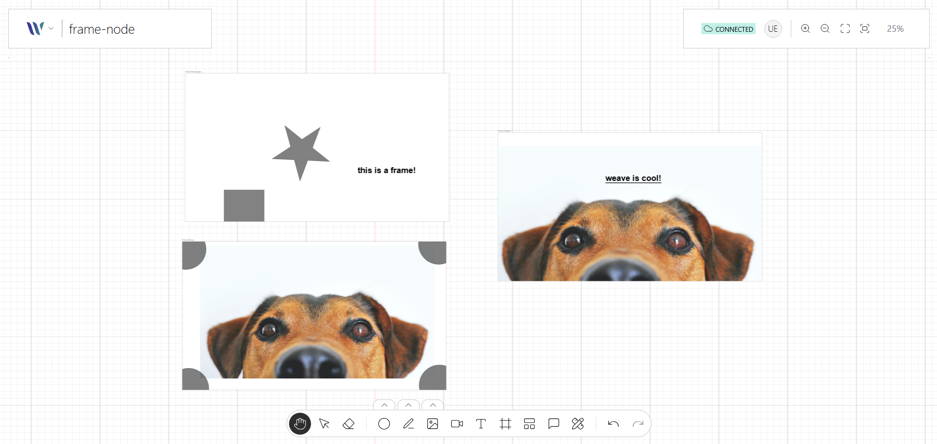
The Frame node is a container-like visual element used to group and organize other nodes within a pre-defined boundary. It functions as a structured layout region, often used to represent panels, sections, or modular components on the canvas.
Built using a combination of primitive shapes, the Frame node can include a title, background, border, and optional interactive handles. It supports nesting of child Nodes, making it ideal for modular UIs, flow sections, or structured diagrams.
Selecting and moving a frame
A frame can be selected by clicking its title or any of its four edges. The clickable band
along the edges is measured in screen pixels (see edgeHitWidth in the
Frame API reference), so edges remain easy to hit when
the canvas is zoomed out. Clicking the empty inside of a frame does not select it. Once selected,
the frame can be dragged from its title or edges, and the pointer shows the move cursor while dragging.
While a node is dragged over a frame, its border is highlighted with the onTargetEnter color. The highlight
uses the same width as the selection outline (transform.borderStrokeWidth) at any zoom level.
Hover and selection feedback uses the colors of the Nodes Selection plugin, as for any other node.
Usage
Import the Node
Start by importing the node:
import { WeaveFrameNode } from "@inditextech/weave-sdk";Register the Node
Then register the node on the Weave class instance.
const instance = new Weave({
  ...
  nodes: [
    ...,
    new WeaveFrameNode(), (1)
  ]
})| 1 | Added in this step. |
Use the node
We provide an action named Frame Tool that allows users to add Frame nodes to the application.